The first month of 2016 is almost over. It never seems enough, but for months now I have been working on giving my web site a makeover. The changes include some basic elements as well as a lot of new features. Here they are:
1. Logo and tagline
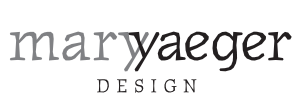
Nice to have for any web site is a logo and a tagline that captures the flavor or style you are striving for. My new logo for Mary Yaeger Design was helped along by suggestions from graphic designer professionals and a few close friends. Here is what we came up with:
Let me describe a couple of the elements in the logo and why I chose them.
My last name is Yaeger, and the “a before e” often gets reversed, even when I tell people repeatedly the correct spelling. It is just too easy for me or anybody else to spell it wrong. This has happened so often that I considered registering a domain name with maryyeagerdesign and having a second gmail account to catch all the wrong entries. It is a very easy typo to make, one I often catch myself making.
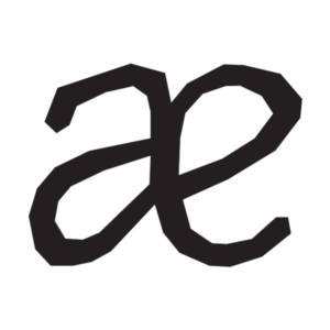
My last name being part of my brand, a clever friend suggested I use the ligature, something I would never have thought of:

Very cool, an effect accentuated by the shape of the letterforms in Émigré’s Journal font.
I also decided to overlap the two y’s that occur in my first and last name. I liked them both, so I decided to use them both. For a bead artist obsessed with little shapes, it was too fun to resist and I’ll play with them on these pages.
Next: Thinking up a tagline

Leave a Reply